COMMUNITY PARK PIK 2
Project Scope
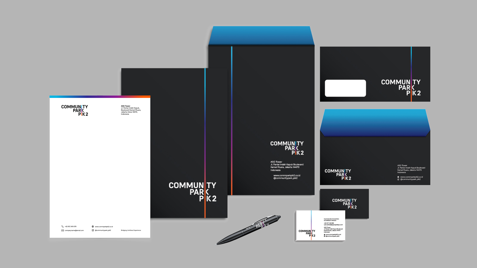
Design / Branding
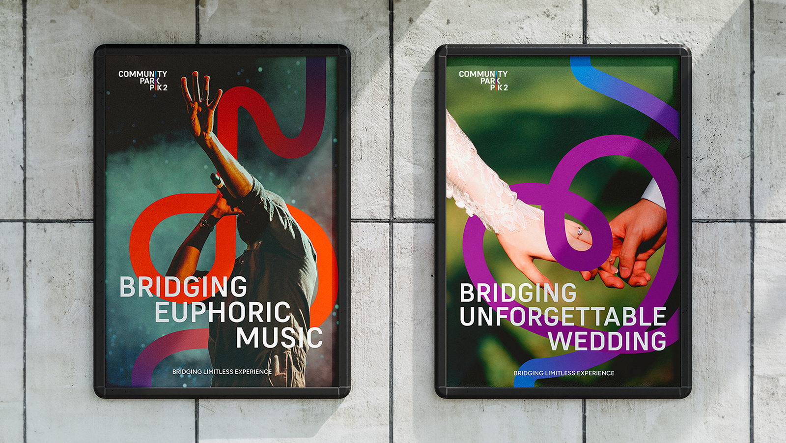
Community Park is a new community-driven multi purpose outdoor space with 2 connected areas by iconic bridges. It offers unlimited outdoor experiences from concerts, to outdoor weddings.
Bridging the park's values
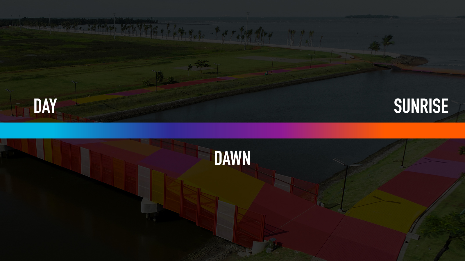
Community Park PIK 2 identity is presented in a continuous line. It is the depiction of the unlimited activity that people can do and enjoy at Community Park PIK2. The line is also symbolizing the “Bridging Limitless Experience” brand essence. The gradient color is taken from the architect's concept of "sunrise", "day", and "dawn" that they used for the park's path color.
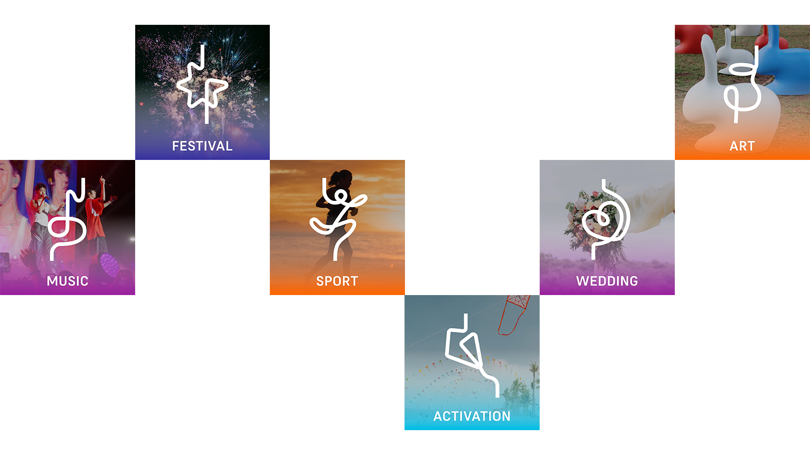
Flowy, adaptable, & continuous
The super graphic can shape various forms to represent each event, activity, or topic. The element is a continuous line. Every element always has a straight line as the starting and ending points to create continuity from the logo’s line.